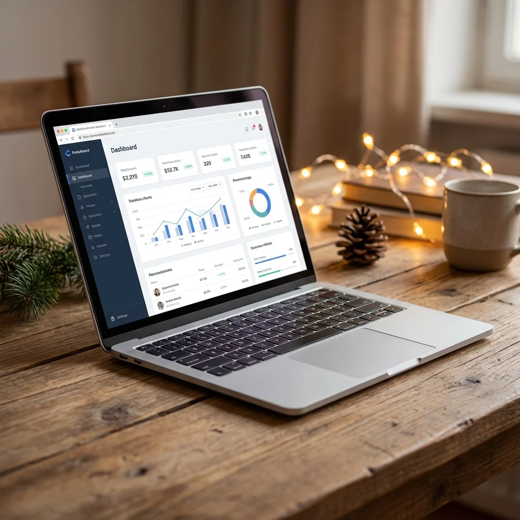
It’s tempting to deck the digital halls with animated snow and autoplaying jingles, but user experience should always come first. Here are 5 checks to keep your site on the 'Nice' list.
- Snowfall scripts and heavy animations kill battery life and conversion rates.
- Hidden navigation menus frustrated last-minute shoppers.
- Clear, visible shipping deadlines build trust faster than discount codes.
- Mobile traffic peaks during the holidays - optimise thumb zones now.

Christmas is the season of giving, but nothing says "Scrooge" like a website that takes 10 seconds to load because of a falling snow script. As businesses rush to capitalise on the festive season, user experience (UX) often gets buried under digital tinsel.
Here is your 5-point audit to ensure your site stays on Google's 'Nice' list this December.
1. The Ghost of Layout Shifts Past
We've all seen it: you go to click "Buy Now" and a giant banner announcing "HOLIDAY SALE" pops up, shifting the entire page down. You accidentally click an ad instead. This is a Cumulative Layout Shift (CLS), and it infuriates users.
The Fix: Reserve space for your holiday banners in the CSS. Don't let festive elements push your core content around after the page has started loading.
2. Autoplay Audio is Coal in the Stocking
Imagine browsing for a gift at work, or late at night while the family sleeps. Suddenly, "Jingle Bells" blasts at full volume from your browser tab. That visitor is gone, and they aren't coming back.
The Fix: Never use autoplay audio. If you must have festive music, make it a user-initiated click with a clearly visible "Play" button (and an even clearer "Stop" button).
3. Don't Hide the Sleigh (Make Shipping Clear)
The number one anxiety for December shoppers is: "Will it arrive in time?" If a user has to dig through your FAQ page to find your last shipping dates, you are losing sales.
The Fix: Place your "Order by Dec 18th for Christmas Delivery" message clearly in the header or near the "Add to Cart" button. It acts as both a trust signal and a tool for urgency.
4. Mobile-Friendly is Not Optional
Holiday shopping happens on the sofa, on the commute, and in line at the coffee shop. If your festive "snow" effect covers the "Checkout" button on an iPhone, you are donating revenue to your competitors.
The Fix: Test your holiday updates on a real phone, not just a resized browser window. Ensure buttons are thumb-sized (at least 44x44 pixels) and not obscured by floating decorations.
5. Speed is the Greatest Gift
High-resolution images of gift wrapping and unoptimised scripts for countdown timers can bloat your page size. Every second of delay reduces conversion rates by 4.42%.
The Fix: Compress your holiday assets. Use WebP formats for images and lazy-load any content that falls below the fold. Ask yourself: does this decoration add value, or just weight?
Quick Holiday Checklist
Before you launch your campaign, tick these off:
- Check mobile speed: Is the 'snow' slowing down the scroll?
- Verify links: Do your "Gift Guide" banners actually link to live pages?
- Test forms: Can you complete a purchase without friction?
- Update hours: Are your holiday opening times clearly visible?
Conclusion: Delight, Don't Distract
The best Christmas website design is one that helps the user accomplish their goal - whether that's buying a gift, booking a table, or finding your address - with ease and joy. Keep the festive touches subtle, keep the performance high, and you will have a very happy New Year.